|
|
| Author |
Message |
RavenStylez
Joined: 11 Oct 2012
Posts: 51
|
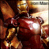
 Posted: Fri Oct 26, 2012 9:51 am Post subject: Background (1920x1080) Posted: Fri Oct 26, 2012 9:51 am Post subject: Background (1920x1080) |
 |
|

Please tell me what you think of it! 
I would prefer possitve feedback, but (if you want) feel free to hate
_________________
http://imageshack.us/a/img88/8328/ezioyk.png
Link is a forum signature of mine. Posted as link because of the guidelines!
Imagination is bigger than inspiration. |
|
|
|
|
 |
thehermit
Joined: 05 Mar 2003
Posts: 3987
Location: Cheltenham, UK
|
| Posted: Sat Oct 27, 2012 6:13 am Post subject: |
|
|
Not sure about the text but the rest is well done 
_________________
If life serves you lemons, make lemonade! |
|
|
|
|
|
SSO
Joined: 26 Jun 2012
Posts: 105
Location: Denmark
PS Version: CS5
OS: Mac OS X
|
| Posted: Sat Oct 27, 2012 6:54 am Post subject: |
|
|
It looks like everything but the knight and the text is in a really bad quality, which makes the rest of the image look -low-quality as well. I don't know where you found your 3D render, but http://planetrenders.net/ is a really good site for high-quality renders - abstract or not.
I agree with hermit on the text, it doesn't not really fit in, and looks like it was made quickly only because it had to be there. If that is the case, I would prefer not to make any text.
_________________
24" |
|
|
|
|
|
xquisnhr
Joined: 27 Nov 2012
Posts: 7
Location: Chino Hills, CA
|
| Posted: Tue Nov 27, 2012 1:27 am Post subject: |
|
|
i completely agree with the text, i would add some kind of effect and go through all my fonts until i found one that fit best lol, but other than that i think it looks rather good...
some areas of your render do look a bit pixelated like its been sharpened too much or something...idk just my thoughts i think you have a nice piece here overall my friend
_________________
When you feel like stopping is when you just keep going... keep your head up, could ALWAYS be worse. |
|
|
|
|
|
thecreative4you
Joined: 03 Dec 2012
Posts: 5
|
| Posted: Mon Dec 03, 2012 2:33 am Post subject: |
|
|
Not my style of graficdesign but i think its good, the text needs some effect it doesn´t fit to the background/image |
|
|
|
|
|
|


