|
|
| Author |
Message |
bullywug
Joined: 09 Apr 2015
Posts: 2
|
 Posted: Thu Apr 09, 2015 6:55 am Post subject: Banner design needs polish Posted: Thu Apr 09, 2015 6:55 am Post subject: Banner design needs polish |
 |
|
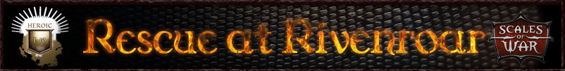
Hello all,
I've created this banner for a Dungeons & Dragons game but I'm not entirely happy with it. I don't know what to improve so I'm looking for feedback.
Thanks,
Charles
| Description: |
|
| Filesize: |
32.87 KB |
| Viewed: |
724 Time(s) |
|
|
|
|
|
|
 |
Patrick
Administrator

Joined: 14 Feb 2003
Posts: 11945
Location: Harbinger, NC, U.S.A.
|
| Posted: Sat Apr 11, 2015 4:52 pm Post subject: |
|
|
|
|
|
|
|
|
bullywug
Joined: 09 Apr 2015
Posts: 2
|
| Posted: Mon Apr 13, 2015 12:46 pm Post subject: |
|
|
Thank you for the warm welcome Patrick and for the feedback on my banner design. I've incorporated the suggestions you made and I'm uploading the revised banner design for you to review, if you would like.
The badge wasn't necessary but I thought it provided balance. I've removed it and increased the size of the text and the "Scales of War" logo. The text is more readable, though I liked the way the fire in the other one was more clearly fire. I disabled the inner glow on the text to try to make the fire more dynamic and it works but I think it might loose something in readability. Anyway, you're feedback is appreciate. The first revision (2) has the inner glow filter on and the second (2a) has it off.
| Description: |
| Revised banner image without the inner glow filter. |
|
| Filesize: |
31.27 KB |
| Viewed: |
688 Time(s) |

|
| Description: |
| Revised banner image with inner glow filter on text. |
|
| Filesize: |
31.66 KB |
| Viewed: |
688 Time(s) |

|
|
|
|
|
|
|
Patrick
Administrator
Joined: 14 Feb 2003
Posts: 11945
Location: Harbinger, NC, U.S.A.
|
| Posted: Tue Apr 14, 2015 5:25 pm Post subject: |
|
|
|
|
|
|
|
|
512pixel
Joined: 28 May 2015
Posts: 4
|
| Posted: Thu May 28, 2015 2:41 pm Post subject: |
|
|
The colours in the forground are bright and do refelct the material gold. The back ground should be centered but take down the opacity of the background so it no fighting between th letters(foreground) Reason for this choice the letter and background are fighting for dominance of the foreground making it harder to read the letters . by making the background less visible it will make it be in the background
|
|
|
|
|
|
|


