|
|
| Author |
Message |
yavart
Joined: 24 Nov 2012
Posts: 3
|
 Posted: Sat Nov 24, 2012 12:14 pm Post subject: my Music Cover photos Posted: Sat Nov 24, 2012 12:14 pm Post subject: my Music Cover photos |
 |
|
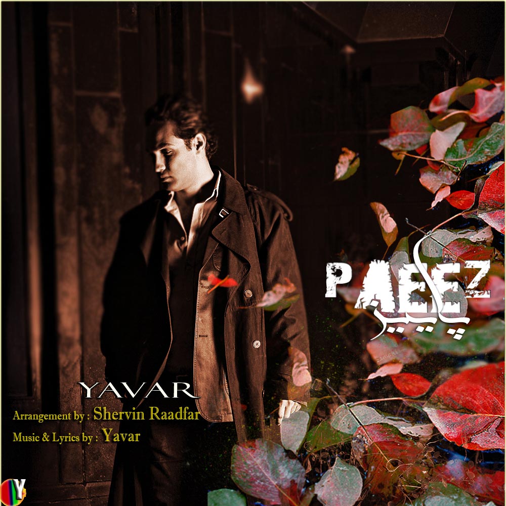
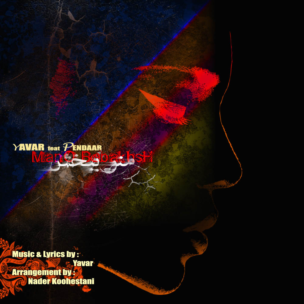
Hi all im new here from Tehran Iran, im trying to do some PS works for my single music tracks and i will be thankful to get any advise or critique from you as i know they will be very helful for my music to be heard and seen through the internet. these are 2 of my works for my recent tracks, what do you think ? BTW forgive my english in advance i might not be so good at it 
| Description: |
|
| Filesize: |
197.5 KB |
| Viewed: |
792 Time(s) |
|
| Description: |
|
| Filesize: |
164.3 KB |
| Viewed: |
792 Time(s) |
|
|
|
|
|
|
 |
RavenStylez
Joined: 11 Oct 2012
Posts: 51
|
| Posted: Sat Nov 24, 2012 1:02 pm Post subject: |
|
|
Both are awesome except for the text.
I wish I could describe what you're doing wrong, but it just doesn't look good and I can't tell WHAT.
_________________
http://imageshack.us/a/img88/8328/ezioyk.png
Link is a forum signature of mine. Posted as link because of the guidelines!
Imagination is bigger than inspiration. |
|
|
|
|
|
yavart
Joined: 24 Nov 2012
Posts: 3
|
| Posted: Sat Nov 24, 2012 1:34 pm Post subject: |
|
|
thank u RavenStylez for your attention, i have tryed too many font styles and i got confused by them , may be its the wrong fonts i used, or the texts are just missplaced, any suggestion ?
|
|
|
|
|
|
yavart
Joined: 24 Nov 2012
Posts: 3
|
| Posted: Sat Nov 24, 2012 1:39 pm Post subject: |
|
|
Oh by the way the pics are way too large in here, they will be half the size when they used on the music share websites.
|
|
|
|
|
|
Patrick
Administrator

Joined: 14 Feb 2003
Posts: 11945
Location: Harbinger, NC, U.S.A.
|
| Posted: Sat Dec 01, 2012 2:27 pm Post subject: |
|
|
Welcome aboard, yavart. I agree with RavenStylez in that the text stands out to me as as weakness and it gives it a less polished, upscale feeling. Some ideas for quick adjustments that could make it look better.
For the first cover:
1. Can you remove the rainbow icon on the bottom left? If so, that would be good.
2. Delete the "Arrangement By" and "Music & Lyrics By" lines.
3. Remove the black border around "YAVAR."
4. Move "YAVAR" so that it is centered beneath "PAEEZ." There should be some vertical space between the two: maybe 20 or 30 pixels.
For the second cover:
1. Make "YAVAR" all the same font. Make it bigger and move it up a bit so there is a little more vertical space between your name and the name of the song.
2. Make "feat PENDAAR" all the same font and move it so that it is beneath the song title. Give it some vertical space so that it isn't pressed right against the title.
3. Set it like it is off to the right a bit. Just like "YAVAR" is set off to the left above the song title, make it so that "feat PENDAAR" is set off to the right beneath it.
4. Type out "featuring" instead of "feat." I think it looks better. 
5. Delete the "Music & Lyrics By" and "Arrangement By" lines.
6. Change the font color of your name and "featuring PENDAAR" to either be white or to match a light color featured in the image itself. The cream/off white color looks strange, since it is not in the composition already.
I hope this helps and I look forward to seeing the adjusted works if you create them.
Thanks,
Patrick
_________________
Patrick O'Keefe - PhotoshopForums.com Administrator
Have a suggestion or a bit of feedback relating to PhotoshopForums.com? Please contact me!
User Guidelines |
|
|
|
|
|
thecreative4you
Joined: 03 Dec 2012
Posts: 5
|
| Posted: Mon Dec 03, 2012 2:35 am Post subject: |
|
|
Oh, i also can´t tell what is bad but something is not working, i think the styles of both images aren´t good.
|
|
|
|
|
|
|


