|
|
| Author |
Message |
hytham
Joined: 17 Nov 2011
Posts: 37
Location: 64
|
 Posted: Wed Feb 15, 2012 12:17 am Post subject: Restaurant Logo Posted: Wed Feb 15, 2012 12:17 am Post subject: Restaurant Logo |
 |
|
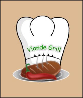
Hello everybody
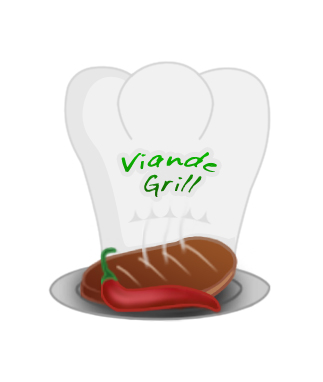
I made this logo for a restaurant i imagined it's name...Please I wanna know your opinions and suggestions about it
| Description: |
|
| Filesize: |
98.1 KB |
| Viewed: |
2021 Time(s) |
|
|
|
|
|
|
 |
jerryb4417
Joined: 20 Dec 2008
Posts: 710
Location: Oklahoma
PS Version: photoshop cs5
OS: win7 pro 64 bit, i7-3.2g, GTS 450,
|
| Posted: Wed Feb 15, 2012 9:20 am Post subject: |
|
|
hi,
this is strictly opinion.... smiling and every one has a opinion ..
now it looks fine but to me it missing something and i am not quite sure what it is... anyway
1. I think it would help if we knew what kind of grill ie: meat , fish, bbq, or spicy etc..... also what your perception of the the place s about. a fun place . layback friendly place etc....
2. that big black line border not sure i like that, right now i am thinking of a oval shape or just without the black border and tan background ..
3. the font .... it ok but no pizazs .. just an idea..
have Vianda in large letters and grill in small or have then on two seperate overlappinglines .. ilike the idea of curves.. promotes friendliness..
thats all i can think of... at the moment... it early in the morning.. smiling.... and like i said just a opinion ..
|
|
|
|
|
|
Cloudless_Creative
Joined: 23 Dec 2011
Posts: 113
PS Version: Adobe CS5
OS: Mac
|
| Posted: Wed Feb 15, 2012 5:33 pm Post subject: |
|
|
Hi, great composition everything Jerry said was spot on, just one thing - Comic Sans, its an awful typeface, maybe experiment with fonts?
The Logo overall gives a french feel to me? Anyway, well done and keep up the good work 
_________________
Those who dare to waste one moment of time have not yet discovered the value of life. |
|
|
|
|
|
Netaddict
Joined: 16 Feb 2011
Posts: 332
Location: Earth
PS Version: CS6
OS: Windows 7 Professional
|
| Posted: Thu Feb 16, 2012 1:47 am Post subject: |
|
|
| Description: |
|
| Filesize: |
36.45 KB |
| Viewed: |
1989 Time(s) |
|
|
|
|
|
|
|
Netaddict
Joined: 16 Feb 2011
Posts: 332
Location: Earth
PS Version: CS6
OS: Windows 7 Professional
|
| Posted: Thu Feb 16, 2012 1:49 am Post subject: |
|
|
Why didn't the text I typed in my last post appear, anyway here it is again
Looks great! One thing though, please remove the black border around the chief's hat. If you have to haver the black border, just reduce it's thickness.
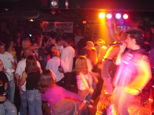
I don't know about the empty space in the background. How about putting a blurred image in the background, like the one I attached that indicates the place is fun unless it's a formal meat grill. I say blurred background so it doesn't take the viewers attention of the chief's hat and grilled meat
I like the font as is because it gives a playful fun feeling to the logo unless of course you "imagine" your restaurant to be an expensive classy grill, then put a more formal looking font. In comparison, chill's logo ( a grilled meat restaurant) is all in Commic Sans font and all the letters are the same size
http://images.wikia.com/theoffice/images/6/65/Chilli's_.jpg
Now I'm hungry with all this talk about food :-)
|
|
|
|
|
|
Cloudless_Creative
Joined: 23 Dec 2011
Posts: 113
PS Version: Adobe CS5
OS: Mac
|
| Posted: Thu Feb 16, 2012 6:46 pm Post subject: |
|
|
I'm sorry but I have to disagree, Comic Sans was meant for Microsoft Bob and that is where it should of been left unless being used to advertise a 5 years and under fancy dress party, there are some nice 'playful' typefaces out there that are sophisticated and modern at the same time. It's just my opinion but using Comic Sans screams amateur to me, I agree with the background comment too - would work nicely with the blurred image of a restaurant or scene 
_________________
Those who dare to waste one moment of time have not yet discovered the value of life. |
|
|
|
|
|
hytham
Joined: 17 Nov 2011
Posts: 37
Location: 64
|
| Posted: Fri Feb 17, 2012 1:08 pm Post subject: |
|
|
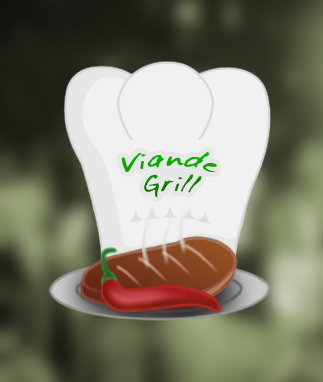
Thanks a lot all for your advices
I modified the logo...I removed the black border and tan background and i made the hat outline lighter so i had to make the hat color darker!..i think it's look better now..plus i changed the font typeface....But i couldn't get how to add blurred background as Netaddict said.
| Description: |
|
| Filesize: |
90.41 KB |
| Viewed: |
1944 Time(s) |
|
| Description: |
|
| Filesize: |
71.76 KB |
| Viewed: |
1944 Time(s) |
|
|
|
|
|
|
|
jerryb4417
Joined: 20 Dec 2008
Posts: 710
Location: Oklahoma
PS Version: photoshop cs5
OS: win7 pro 64 bit, i7-3.2g, GTS 450,
|
| Posted: Fri Feb 17, 2012 1:31 pm Post subject: |
|
|
hi,
as far as the background that will always change on you, when you put it on a buxiness card or it going to be on a sign etc... so it not that important,,, to me the white background is fine for now...
the text seem better and more friendlier .. and smitch of class to it... although I keep thinking it needs to be larger maybe the other guys have some thoughts to that..
now viande i found out is a french word for meat... and yet we have a spicy red chili pepper?? to me, is the grill going to be known for spicy food? french food? mexican food?
|
|
|
|
|
|
hytham
Joined: 17 Nov 2011
Posts: 37
Location: 64
|
| Posted: Fri Feb 17, 2012 1:56 pm Post subject: |
|
|
Actually i selected Viande Grill name randomly, I have no idea about the restaurant or food type because i have no real client ....I just wanted to make an exam for myself plus i wanna make nice portfolio to get work in the future...but i put a piece of meat..it's mean that this restaurant is for grilled meat...I wanna ask about if the drawing of plat,meat,and chill is ok ?...i think it's need to be more abstract not very direct as i made..?
|
|
|
|
|
|
esprintguy
Joined: 17 Feb 2012
Posts: 14
|
| Posted: Tue Apr 03, 2012 11:08 pm Post subject: |
|
|
I'm sorry but it looks less like a chef's hat and more like a tooth. That's why the first though I had was this was a design for a dentist's office or something. I understand that you need to make things simple, but your logo needs a lot of work in order to be a unique, memorable logo.
|
|
|
|
|
|
|


