|
|
| Author |
Message |
Daryl
Joined: 17 Aug 2005
Posts: 45
Location: ireland
|
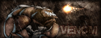
 Posted: Sun Oct 23, 2005 11:57 am Post subject: venom Posted: Sun Oct 23, 2005 11:57 am Post subject: venom |
 |
|
rate + comment please
| Description: |
|
| Filesize: |
79.3 KB |
| Viewed: |
1591 Time(s) |
|
_________________
fairy tales are makebelieve
-daryl- |
|
|
|
|
 |
malcon
Joined: 23 Feb 2005
Posts: 391
Location: miami florida
|
| Posted: Sun Oct 23, 2005 7:05 pm Post subject: |
|
|
very nice. i like the lighting alot. the rain looks good too. maybe post a bigger image. looking good!
|
|
|
|
|
|
ekosh

Joined: 01 Jun 2005
Posts: 216
Location: US of A
|
| Posted: Sun Oct 23, 2005 10:18 pm Post subject: |
|
|
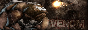
looks good I feel like it needs to be cropped to something like below
| Description: |
|
| Filesize: |
40.54 KB |
| Viewed: |
1578 Time(s) |
|
|
|
|
|
|
|
cyborg
Joined: 12 Oct 2004
Posts: 1102
Location: canada
|
| Posted: Mon Oct 24, 2005 9:47 am Post subject: |
|
|
id give it an 8...venoms color looks abit odd...good job though
|
|
|
|
|
|
malcon
Joined: 23 Feb 2005
Posts: 391
Location: miami florida
|
| Posted: Mon Oct 24, 2005 2:58 pm Post subject: |
|
|
|
|
|
|
|
|
Daryl
Joined: 17 Aug 2005
Posts: 45
Location: ireland
|
| Posted: Wed Oct 26, 2005 9:56 am Post subject: |
|
|
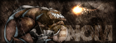
here it is with your suggest on it malcon
| Description: |
|
| Filesize: |
81.23 KB |
| Viewed: |
1536 Time(s) |
|
_________________
fairy tales are makebelieve
-daryl- |
|
|
|
|
|
ekosh
Joined: 01 Jun 2005
Posts: 216
Location: US of A
|
| Posted: Wed Oct 26, 2005 11:27 am Post subject: |
|
|
I dont like it with the larger letters it looks like you are trying to watermark it instead of putting your name into it, just a thought
|
|
|
|
|
|
malcon
Joined: 23 Feb 2005
Posts: 391
Location: miami florida
|
| Posted: Wed Oct 26, 2005 1:28 pm Post subject: |
|
|
yeh thats the right track try making the letters smaller and not so transparent. like maybe just some of the V overlapping onto the character. but you will need the text to be more solid. but yeah man. to me that will being it together more. i think you just over did it a little...you know what, you could probably almost have the text the same size as the origonal and just move it over a little. maybe make it slightly bigger.
|
|
|
|
|
|
Daryl
Joined: 17 Aug 2005
Posts: 45
Location: ireland
|
| Posted: Wed Oct 26, 2005 3:18 pm Post subject: |
|
|
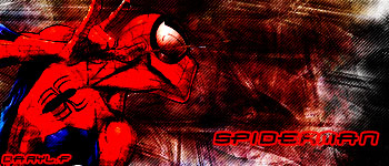
well on the theme of venom..i made this spiderman sig aswel
| Description: |
|
| Filesize: |
59.95 KB |
| Viewed: |
1516 Time(s) |
|
_________________
fairy tales are makebelieve
-daryl- |
|
|
|
|
|
Gallo_Pinto

Joined: 15 Jul 2005
Posts: 785
Location: BC, Canada
|
| Posted: Thu Oct 27, 2005 1:42 pm Post subject: |
|
|
I think venom should be a lot more red, like spidy is in your other post. i just say so because, without the text, I'm not sure he's really quickly recognizeable.
_________________
brush your hair and comb your teeth |
|
|
|
|
|
|


