|
|
| Author |
Message |
FadedinPS23

Joined: 27 Dec 2004
Posts: 183
|
 Posted: Sat Jan 01, 2005 3:14 am Post subject: a better looking template Posted: Sat Jan 01, 2005 3:14 am Post subject: a better looking template |
 |
|
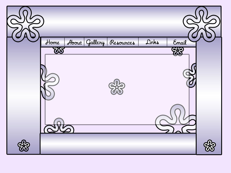
This is another template that i did. I'm just practicing. I start a web design class in about two weeks and I wanted to see what I can do before getting taught. Comments are much appreciated.
Sincerely,
Lil J
| Description: |
|
| Filesize: |
60.44 KB |
| Viewed: |
725 Time(s) |
|
|
|
|
|
|
 |
vel
Joined: 05 Oct 2004
Posts: 339
Location: oc|ca|usa
|
| Posted: Sat Jan 01, 2005 4:08 am Post subject: |
|
|
It pretty nice, but left and right sides are not symmetrical (it'll look much better if equal  ) )
Uuum, try not to have images inside the "content" area, where you're going to write, b/c unless you use "frames" the bg wont align properly, as the web page expants "height-wise".
_________________
postcount++; |
|
|
|
|
|
hackerman
Joined: 25 Nov 2004
Posts: 45
|
| Posted: Sat Jan 01, 2005 10:55 am Post subject: |
|
|
to....purple. Use different colors!
|
|
|
|
|
|
vel
Joined: 05 Oct 2004
Posts: 339
Location: oc|ca|usa
|
| Posted: Sat Jan 01, 2005 11:17 am Post subject: |
|
|
Its not that, that's just color preference. I dont think he cares which colors, cuz you can just re-do hue and you-re set.
Try going to good-tutorials.com then clicking on Website Interface, or Website Graphics. I have a tutorial on my website that deals with that. Its down in my profile. Called "Curved Design Interface". Hope it helps.
_________________
postcount++; |
|
|
|
|
|
microdude431
Joined: 31 Dec 2004
Posts: 11
|
| Posted: Sat Jan 01, 2005 10:21 pm Post subject: |
|
|
looks good, just not my style.
_________________
Need a Free Sig, Avatar, or Banner?
Visit the Graphics Request Forums |
|
|
|
|
|
|


