|
|
| Author |
Message |
vel
Joined: 05 Oct 2004
Posts: 339
Location: oc|ca|usa
|
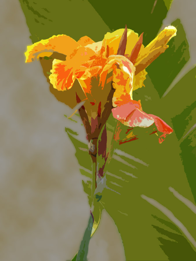
 Posted: Sun Nov 14, 2004 5:10 pm Post subject: flauwer Posted: Sun Nov 14, 2004 5:10 pm Post subject: flauwer |
 |
|
yup-yup.. im gona edit under the petals, but dont have time rinnow.. lol
| Description: |
|
| Filesize: |
105.02 KB |
| Viewed: |
1680 Time(s) |
|
_________________
postcount++; |
|
|
|
|
 |
witam

Joined: 27 Oct 2004
Posts: 812
Location: Belgium
|
| Posted: Sun Nov 14, 2004 7:26 pm Post subject: |
|
|
I like how you made it seem abstract and yet maintained something easily recognisable. Also the colors are great.. by using them like this you really have put the attention on the flower.
The leaves are a nice background. The clouds you did behind it, don't fit. They look grey, which means a darker sky and that doesn't fit with the brightness of your flower. Also the clouds don't look real. I think a gradient in blue in teh background would fit better. But the most important thing you can add to the background is some more leaves. I really like the green background. It really contrasts nicely with the flower.
Overall i like it... the colors and the style.. nice.
Just my opinion..
_________________
Witam
http://members.chello.be/wotsa
http://www.shadowness.com/witam |
|
|
|
|
|
thehermit
Joined: 05 Mar 2003
Posts: 3987
Location: Cheltenham, UK
|
| Posted: Sun Nov 14, 2004 7:31 pm Post subject: |
|
|
Hiya FIss!on
At the moment the images looks like a cross between a few filters in PS. Looks like cutout and maybe another couple of filters.
Filters are no bad thing and I am no filter snob, but to rely on them to do most of the work is time put into misadventure.
Whatever means you have used to create this image doesn't really matter, it's the impression of "out of the can" that is left.
One last moan  The cloud filter is a little obvious at the moment in the background, try diffusing it a little or dsiguising it further. The cloud filter is a little obvious at the moment in the background, try diffusing it a little or dsiguising it further.
On a positive note, I like the subject matter and think that with refinement it could be a great image.
_________________
If life serves you lemons, make lemonade! |
|
|
|
|
|
thehermit
Joined: 05 Mar 2003
Posts: 3987
Location: Cheltenham, UK
|
| Posted: Sun Nov 14, 2004 7:32 pm Post subject: |
|
|
ps - might be tempted to remove the leaf in the background to emphasize the flower, although without distinction to the picture at the moment it's a tough call 
_________________
If life serves you lemons, make lemonade! |
|
|
|
|
|
vel
Joined: 05 Oct 2004
Posts: 339
Location: oc|ca|usa
|
| Posted: Sun Nov 14, 2004 7:34 pm Post subject: |
|
|
yea, thx
the bg was just like green/brown blobs.. so i didnt know what to do...
i did clouds n blur for bg.. kinda looks like its glued onto the back of the flower
thx for comments though, ill try to do sumthin about background, get some more good lookin leaves (palm tree leaves)
_________________
postcount++; |
|
|
|
|
|
cyborg
Joined: 12 Oct 2004
Posts: 1102
Location: canada
|
| Posted: Mon Nov 15, 2004 7:04 am Post subject: |
|
|
that looks really good
|
|
|
|
|
|
vel
Joined: 05 Oct 2004
Posts: 339
Location: oc|ca|usa
|
| Posted: Mon Nov 15, 2004 4:06 pm Post subject: |
|
|
thx.. maybe blur the leaf? have it make less of an impact? and how about bottom left... a bug.. spider? small flower? or leave it alone
just feels like ther's an imbalance
_________________
postcount++; |
|
|
|
|
|
|


