|
|
| Author |
Message |
cyborg
Joined: 12 Oct 2004
Posts: 1102
Location: canada
|
 Posted: Tue Aug 08, 2006 2:39 am Post subject: Help me with this problem... Posted: Tue Aug 08, 2006 2:39 am Post subject: Help me with this problem... |
 |
|
i just got added to msn at 430am....
someone with the screen name E
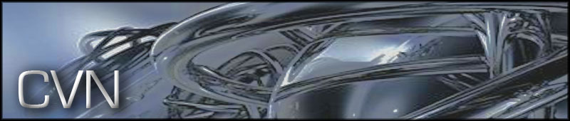
they said they added me from this site and asked me to make a logo.(Below)
i made the image and asked what he thought.
E says:
its heaps good thanks
and suddenly goes offline.
whoever you are can you please post in this thread so i have an idea who you are?
P.S-Patrick im pretty sure this might not fit in this section but its the only one i could see that seemed to fit
| Description: |
|
| Filesize: |
48.38 KB |
| Viewed: |
1046 Time(s) |
|
|
|
|
|
|
 |
malcon
Joined: 23 Feb 2005
Posts: 391
Location: miami florida
|
| Posted: Tue Aug 08, 2006 7:11 pm Post subject: |
|
|
imjust going to review the logo...design review thread.
so the logo they wanted was CVN?
i know the logo wouldnt be all the metallic effects in the background. if so then it is deffinattly to over the top. keep in mind logo's are often in black and white, many different sizes -letter head, buisness cards, brochures etc etc
if the logo is just the CVN...thats pretty simple.
all it looks like to me is text, with a bevel/emboss and a drop shadow. somtimes it works but in this case i dont see anything special about it.
maybe by logo you ment banner, that would make more sence. in that case the banner is pretty good. the background is a bit low quality in relation to the text.
anyway maybe if you dont find the guy that sent you the message or somthing, the review of your design will help...keep it up.
-malcon
(very odd thread)
_________________
http://malconpierce.deviantart.com/
http://malcon.cgsociety.org/gallery/
FOR HIRE! malconpierce@gmail.com |
|
|
|
|
|
Patrick
Administrator

Joined: 14 Feb 2003
Posts: 11945
Location: Harbinger, NC, U.S.A.
|
| Posted: Wed Aug 09, 2006 6:02 pm Post subject: |
|
|
|
|
|
|
|
|
cyborg
Joined: 12 Oct 2004
Posts: 1102
Location: canada
|
| Posted: Wed Sep 13, 2006 11:07 am Post subject: |
|
|
| malcon wrote: | imjust going to review the logo...design review thread.
so the logo they wanted was CVN?
i know the logo wouldnt be all the metallic effects in the background. if so then it is deffinattly to over the top. keep in mind logo's are often in black and white, many different sizes -letter head, buisness cards, brochures etc etc
if the logo is just the CVN...thats pretty simple.
all it looks like to me is text, with a bevel/emboss and a drop shadow. somtimes it works but in this case i dont see anything special about it.
maybe by logo you ment banner, that would make more sence. in that case the banner is pretty good. the background is a bit low quality in relation to the text.
anyway maybe if you dont find the guy that sent you the message or somthing, the review of your design will help...keep it up.
-malcon
(very odd thread) |
yes, actually it is a banner....and i realize that the quality is low...that happened when i saved the file...i saved it with a lower quality by mistake,
|
|
|
|
|
|
|


