|
|
| Author |
Message |
riddle
Joined: 09 Mar 2006
Posts: 7
|
 Posted: Thu Mar 09, 2006 7:39 am Post subject: New Logo Posted: Thu Mar 09, 2006 7:39 am Post subject: New Logo |
 |
|
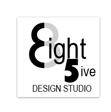
im tryin to come up with a new modern logo and this is the best i can come up with, is there anybody out there that can help me i would be much apprecitated i have designers block.
| Description: |
|
| Filesize: |
2.57 KB |
| Viewed: |
1753 Time(s) |

|
| Description: |
|
| Filesize: |
2.57 KB |
| Viewed: |
1753 Time(s) |
|
Last edited by riddle on Thu Mar 09, 2006 10:57 am; edited 2 times in total |
|
|
|
|
 |
Patrick
Administrator

Joined: 14 Feb 2003
Posts: 11945
Location: Harbinger, NC, U.S.A.
|
| Posted: Thu Mar 09, 2006 10:01 am Post subject: |
|
|
|
|
|
|
|
|
Gallo_Pinto

Joined: 15 Jul 2005
Posts: 785
Location: BC, Canada
|
| Posted: Mon Mar 20, 2006 5:46 pm Post subject: |
|
|
I realy like the way the d is lower-cas to fit around the g. that's cool. The grey outline around "eight five" is too dark, I would lighten that up quite a bit.
it seems to be fashionable to make things have a sort of reflection on them. it's done by making a curved selection and then draggin low-opacity gradients so it look skinda plasticy. I don't know how else to describe it, hope you know what i mean. I could see this logo going that way or looking like it's old, rusty, sort of a grunge look.
_________________
brush your hair and comb your teeth |
|
|
|
|
|
riddle
Joined: 09 Mar 2006
Posts: 7
|
| Posted: Tue Mar 21, 2006 4:39 am Post subject: |
|
|
I was seeing if anyone could design anything better for me, i like what ive done but i can see it from only one point of view, i would like to see other peoples vision.
|
|
|
|
|
|
robvr6
Joined: 29 Jan 2005
Posts: 31
|
| Posted: Sun Apr 02, 2006 7:19 pm Post subject: |
|
|
why not incorporate the numbers 8 and 5 into your design, Ive attached an example (very rough) like 4or5 mins work. With some adjustment it may work
| Description: |
|
| Filesize: |
12.62 KB |
| Viewed: |
1537 Time(s) |
|
|
|
|
|
|
|
riddle
Joined: 09 Mar 2006
Posts: 7
|
| Posted: Tue Apr 04, 2006 8:12 am Post subject: |
|
|
i like where your coming from with that idea, thats defiantly a option any other things u think i can change. pm and we sort something out proper
|
|
|
|
|
|
robvr6
Joined: 29 Jan 2005
Posts: 31
|
| Posted: Tue Apr 04, 2006 4:40 pm Post subject: |
|
|
pm sent
|
|
|
|
|
|
|


