|
|
| Author |
Message |
TiDaL

Joined: 12 Apr 2003
Posts: 384
|
 Posted: Wed Sep 22, 2004 6:51 pm Post subject: Wanting to make some money template* Posted: Wed Sep 22, 2004 6:51 pm Post subject: Wanting to make some money template* |
 |
|
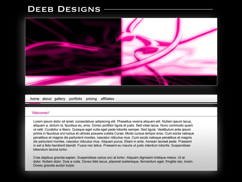
well i made this the other day, the banner is a art peice i made once and the website would look good in almost any color if pink isn't your thing. I am hoping that some1 will either pay me for the template or hire me to make there website
also if anybody has any information on either letting me work with them or for them let me no
website was gonna be for a company called "deeb designs" however of course they backed out
please feel free to crituqe or gimme a pat on the back for the template design ;-)
| Description: |
|
| Filesize: |
233.01 KB |
| Viewed: |
2061 Time(s) |
|
_________________
http://i337m1k3.deviantart.com for my ART Profile. |
|
|
|
|
 |
thehermit
Joined: 05 Mar 2003
Posts: 3987
Location: Cheltenham, UK
|
| Posted: Thu Sep 23, 2004 2:39 am Post subject: |
|
|
The header is a little on the large side. Given that the average browser of the web still browses at 800x600 that only gives a maximum of 792x410px to actually work with. Anything below that 410px margin will initially be invisible to viewers (such as yout navigation).
_________________
If life serves you lemons, make lemonade! |
|
|
|
|
|
webguy
Joined: 25 Aug 2004
Posts: 165
Location: Canada
|
| Posted: Thu Sep 23, 2004 3:11 pm Post subject: |
|
|
I like the colors 
Suits the design well.
But yeah, I agree with theHermit. The header is a bit too large. It fights for attention with the content area.
but overall, here's your pat on the back, it's a good design. 
_________________
Providing small business with high quality affordable websites:
Alberta Custom Websites
Keep up todate with latest virus scares, google, microsoft, linspire and more:
Web and Technology News |
|
|
|
|
|
|


