|
|
| Author |
Message |
sonicboom
Joined: 17 Feb 2009
Posts: 2
|
 Posted: Tue Feb 17, 2009 10:03 am Post subject: Using Spot colours and the problem with sending to printers Posted: Tue Feb 17, 2009 10:03 am Post subject: Using Spot colours and the problem with sending to printers |
 |
|
Hi all,
I have searched high and low on google for an answer. I have even phoned our usual printers, but no one seems to be able to give me an answer and I am not sure if what I ask is even possible in Photoshop........Ok here goes:
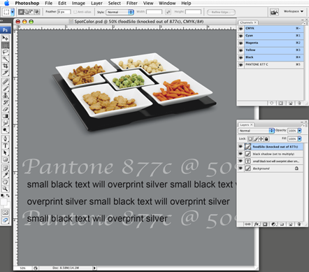
I have a CMYK design which is going to be printed using the lithographic method. The design is done in Photoshop CS3 and then converted to PDF when being sent to the printers.
The design consists of 3 layers.
1 (top layer) - Black text
2 (middle layer) - White shape (set to 50%) transparent and an image
4 (lowest layer) - Silver background to be printed as Pantone 877 C (Metallic Coated)
The problem I have is when sending to the printers they first told me that the pantone code was missing, so I learnt how to use spot colours using the channel part of PS. But when I use spot colours they always seem to be on top of all the layers. So all I would get is the silver printing out. I have tried cutting out the spot colour area so that the text and shape can show through, but the printers tell me that the text is not showing right. I all looks fine in PS and as a PDF. An example of what I am trying to achieve is below.......
Is there a right and wrong method for using PS in the print industry? Also I don't really need to be told use another product etc. As the company I work for has a limited budget. We do have illustrator CS3 though, but all designs have been done in photoshop.....
Any God like photoshop experts around to solve this one? *crosses fingers*. Thanks in advance! Paul.

|
|
|
|
|
 |
Sublimity

Joined: 07 Feb 2009
Posts: 92
Location: Canada
PS Version: Master Collection CS3/CS4
OS: XP SP2/3/Vista
|
| Posted: Wed Feb 18, 2009 1:51 am Post subject: |
|
|
Hi Paul,
Have you tried saving and printing using the .EPS format? I'm not a regular in the print shop, but I never went wrong using pantone and encapsulated postscript.
|
|
|
|
|
|
combiBob
Joined: 11 Mar 2008
Posts: 188
Location: Florida
|
| Posted: Wed Feb 18, 2009 8:23 am Post subject: |
|
|
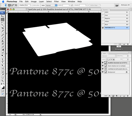
I'm thinking maybe the CMYK scooter silo was not knocked out of the Pantone plate and that's why it looked weird. This is what the finished piece should look like once it's flattened and saved as a PDF. (Flattening does not delete, or merge the spot channel.)
| Description: |
|
| Filesize: |
120.79 KB |
| Viewed: |
300 Time(s) |
|
|
|
|
|
|
|
combiBob
Joined: 11 Mar 2008
Posts: 188
Location: Florida
|
| Posted: Wed Feb 18, 2009 8:25 am Post subject: |
|
|
And this is what your channel (viewed separately) should look like.
| Description: |
|
| Filesize: |
71.51 KB |
| Viewed: |
298 Time(s) |
|
|
|
|
|
|
|
tedc
Joined: 18 Feb 2009
Posts: 5
|
| Posted: Wed Feb 18, 2009 1:08 pm Post subject: |
|
|
I agree with combibob.
If you use the silver as a base color the CMKY colors that overprint that would dramatically change as the GMKY inks are semi-transparent.
He can't overprint the silver plate as this would cover the CMYK and a again a color shift .
So as combibob writes the silver plate has to be knocked out, deepetched, or whatever you to call, it for ALL CMKY colors.
If the text is less than 12 pt and is serifed you will could have registration problems.
Unless you are very familiar with the printing industry it may be advisable to steer clear of using metallic inks.
Hope this helps
|
|
|
|
|
|
combiBob
Joined: 11 Mar 2008
Posts: 188
Location: Florida
|
| Posted: Wed Feb 18, 2009 1:50 pm Post subject: |
|
|
| tedc wrote: |
If the text is less than 12 pt and is serifed you will could have registration problems. |
I assumed the body copy would be black, and would overprint the silver without a k/o. Hopefully, the black will be opaque enough to cover the silver.
How dark is 877c silver? Beats me. That's the other fun part of Pantone/spot colors. There's really no way of proofing it. All you can do is simulate it.
|
|
|
|
|
|
combiBob
Joined: 11 Mar 2008
Posts: 188
Location: Florida
|
| Posted: Wed Feb 18, 2009 1:56 pm Post subject: |
|
|
OK. So I just looked at a metallic Pantone book and 877c is light enough to hold black type.
|
|
|
|
|
|
tedc
Joined: 18 Feb 2009
Posts: 5
|
| Posted: Wed Feb 18, 2009 2:09 pm Post subject: |
|
|
Your probably right combiBob, with the text.
My last job in metalic inks was 4 lots of business cards and the printer wanted them layed out as layers in InDesign.
If I remember correctly a spot color red overprinted the silver and then this was varnished, giving a very nice gold.
The motto is "Talk to thre printer before you start"
BTW I'm an old 'retirered' printer. Now working in Graphics for myself.
|
|
|
|
|
|
sonicboom
Joined: 17 Feb 2009
Posts: 2
|
| Posted: Thu Feb 19, 2009 3:17 am Post subject: |
|
|
Hi All,
First of all thanks for the responses. I did post this question on one other forum, and had some good feedback on how to go about it. As you have all correctly pointed out the silver needs to be knocked out, which I had tried but failed due to....yep, registration problems!! I have no option to fail or to use another product, so must keep trying. For those of you who are curious some of the solutions provided are here: http://advancedphotoshop.co.uk/forum/viewtopic.php?p=7072#7072
Hopefully with the information provided by you all here and over on the other board I will get this fixed!! Thank you so much for your help and time!
|
|
|
|
|
|
|


