|
|
| Author |
Message |
cyborg
Joined: 12 Oct 2004
Posts: 1102
Location: canada
|
 Posted: Fri Oct 15, 2004 9:51 am Post subject: Venom signature Posted: Fri Oct 15, 2004 9:51 am Post subject: Venom signature |
 |
|
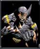
okay well i made this one day and i want to know what you all think of it.
C&C is more than welcome, i dont care if its negative or positive

|
|
|
|
|
 |
weaponx
Joined: 12 Oct 2004
Posts: 21
|
| Posted: Fri Oct 15, 2004 12:08 pm Post subject: |
|
|
The basic design is good i like it. But i would place the text on top of the horizontal lines and select a different text style/color. This i prolly select some metalic style partly cause i think it would look good and partly cause it would be easier to read. The font is good.
_________________
RPG Gaming Community
RPG-Games.org
ADR MOD Forum |
|
|
|
|
|
BryanDowning

Joined: 05 Jul 2004
Posts: 1554
Location: California, USA
|
| Posted: Fri Oct 15, 2004 12:14 pm Post subject: |
|
|
I agree. Good concept, but the font is tough to read. I like that dude on the left. Crazy tongue action.
_________________
Best Regards,
Bryan Downing
bryandowning.com |
|
|
|
|
|
weaponx
Joined: 12 Oct 2004
Posts: 21
|
| Posted: Fri Oct 15, 2004 12:24 pm Post subject: |
|
|
|
|
|
|
|
|
BryanDowning
Joined: 05 Jul 2004
Posts: 1554
Location: California, USA
|
| Posted: Fri Oct 15, 2004 4:04 pm Post subject: |
|
|
Is that from spider-man? I guess he's on the right side, not the left huh? lol
_________________
Best Regards,
Bryan Downing
bryandowning.com |
|
|
|
|
|
cyborg
Joined: 12 Oct 2004
Posts: 1102
Location: canada
|
| Posted: Sat Oct 16, 2004 1:14 pm Post subject: |
|
|
actually for that font i just used smudger than beveled and embossed it, after that i used a 2 px smudge tool to make it look like blood.
|
|
|
|
|
|
dmahat

Joined: 25 Oct 2004
Posts: 175
Location: Virginia
|
| Posted: Tue Oct 26, 2004 2:43 pm Post subject: |
|
|
I like the text, agree with the other guys, kinda hard to read, maybe cause the red grid background.
|
|
|
|
|
|
webguy
Joined: 25 Aug 2004
Posts: 165
Location: Canada
|
| Posted: Fri Oct 29, 2004 12:49 am Post subject: |
|
|
dude!! Venom is awesome!
I recently began collecting comics again after a computer generated "Venom & Carnage" comic came out.. sweet stuff!
I like the sig, but too much red for my tastes.. 
_________________
Providing small business with high quality affordable websites:
Alberta Custom Websites
Keep up todate with latest virus scares, google, microsoft, linspire and more:
Web and Technology News |
|
|
|
|
|
cyborg
Joined: 12 Oct 2004
Posts: 1102
Location: canada
|
| Posted: Fri Oct 29, 2004 7:17 am Post subject: |
|
|
thnx webguy...maybe ill make another version with sum other colours in it?
|
|
|
|
|
|
dmahat
Joined: 25 Oct 2004
Posts: 175
Location: Virginia
|
|
|
|
|
|
|