|
|
| Author |
Message |
darkray16
Joined: 29 Jul 2009
Posts: 2
|
 Posted: Wed Jul 29, 2009 6:11 pm Post subject: beginner trying to make a banner, need some help Posted: Wed Jul 29, 2009 6:11 pm Post subject: beginner trying to make a banner, need some help |
 |
|
hello,
I'm new here, and I am also new to photoshop. I tried asking other people to help me make a banner for my blog but I figured it's best to learn how to do it myself.
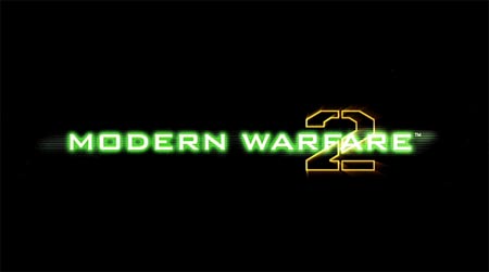
Could someone tell me how to create the green words that look like the ones in the modern warfare 2 picture below?
I got somewhere near it with the outer glow effect but I can't figure out the font, and there are some other effects on the words that I don't know how to do yet.
| Description: |
| this is the logo I'm trying to use |
|
| Filesize: |
6.98 KB |
| Viewed: |
395 Time(s) |
|
_________________
twitter: @darkray16 |
|
|
|
|
 |
Nak
Joined: 29 Jul 2009
Posts: 4
|
| Posted: Wed Jul 29, 2009 6:37 pm Post subject: |
|
|
I'm no pro, but that should be pretty easy.
You're on the right trail with making the font glow (the font type might be owned by COD and not available, so get something close).
For the extra digital effect, you would need to create some thin white lines, and place them under the text layer, then also give them the same glow effect. You could (and i would) put a mask over the lines and reveal and hide where you need to.
I'm sure someone else could give you a more detailed tutorial, but it shouldn't be too hard to figure out either.
also.
You might try doing a google or bing search for call of duty font and see what comes up.
|
|
|
|
|
|
darkray16
Joined: 29 Jul 2009
Posts: 2
|
| Posted: Wed Jul 29, 2009 8:26 pm Post subject: |
|
|
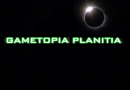
this is the closest I could come. Can someone help me refine it to make it look more like the one logo?
| Description: |
|
| Filesize: |
65.17 KB |
| Viewed: |
368 Time(s) |
|
_________________
twitter: @darkray16 |
|
|
|
|
|
Nak
Joined: 29 Jul 2009
Posts: 4
|
| Posted: Fri Jul 31, 2009 2:54 pm Post subject: |
|
|
you're on the right track. Your digital lines are too thick, make them smaller and make more of them. And you need to add an inner glow (or change the font color from white) so that the letter are a little more of the digital green.
|
|
|
|
|
|
Anatolian
Joined: 06 Jul 2009
Posts: 10
Location: Turkey, Dardanelles
PS Version: PS CS4
OS: Windows 7 RC x86
|
| Posted: Mon Aug 03, 2009 12:22 pm Post subject: |
|
|
|
|
|
|
|
|
|


