|
|
| Author |
Message |
scorpion_666
Joined: 19 Oct 2004
Posts: 75
Location: Lakewood, CO
|
 Posted: Fri Nov 05, 2004 9:02 pm Post subject: First sig ever made!!! Posted: Fri Nov 05, 2004 9:02 pm Post subject: First sig ever made!!! |
 |
|
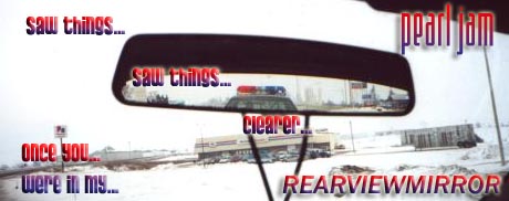
I suck, I know. Please don't short yourselves though. Tell me how I could have improved it. Bonus points for those who can explain it to me, on how for each step.
Peace out peeps!!
| Description: |
|
| Filesize: |
33 KB |
| Viewed: |
1284 Time(s) |
|
|
|
|
|
|
 |
BryanDowning
Joined: 05 Jul 2004
Posts: 1554
Location: California, USA
|
| Posted: Fri Nov 05, 2004 9:18 pm Post subject: |
|
|
Love the concept.
The color and beveling of the text is a little odd. I'm not sure I even like the font too much.
Were you trying to compliment the cops lights with the red/purple gradient?
I would think about editing out the necklace hanging from the mirror and losing the roof in the top right behind Pearl Jam.
I don't like the switch between fonts. I think you should stick with just one. I do like the idea of making "REARVIEWMIRROR" all caps.
The sig is also pretty tall. Maybe you could lose some of the bottom which would also vertically center the mirror in the design.
Great idea though. Are those lyrics to a Pearl Jam song?
_________________
Best Regards,
Bryan Downing
bryandowning.com |
|
|
|
|
|
scorpion_666
Joined: 19 Oct 2004
Posts: 75
Location: Lakewood, CO
|
| Posted: Fri Nov 05, 2004 9:27 pm Post subject: |
|
|
Damn your good man! Shiz on my nizz! lol
Ok for starters I didn't or couldn't be bothered searching through the fonts for text that liked, so I randomly and quickly picked one. I got something like Pussycat for the font and I was like man this is dumb. lol
But it turned out that the Pearl Jam font was lower case as well so I thought it'd mesh well.
I did use some gradient overlays to try to relate to the cop pulling you over with the blue/red foreground to background.
I dunno how to take out the necklace without disturbing the rest of the picture as it was just a jpeg to start with.
So for the text I did use gradient overlay and a couple bevels, and outer glow here and there when needed. I also threw in a drop shadow if the bg was too damn white in spots.
Please any more thoughts or suggestions to improve, I'll listen. An animated cop light would rule of course. lol
N' yes this is the lyrics to the Pearl Jam song "Rearviewmirror".
Edit: Maybe it's just me, but I like it's normalcy to it. It just feels real like a Pearl Jam song ya know? But tell me what you think otherwise of course.
|
|
|
|
|
|
|


