|
|
| Author |
Message |
lestats
Joined: 21 Oct 2004
Posts: 26
|
 Posted: Thu Nov 18, 2004 10:23 pm Post subject: second sig ever! Posted: Thu Nov 18, 2004 10:23 pm Post subject: second sig ever! |
 |
|
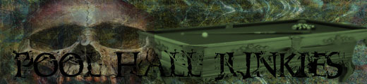
Ok...im screwing around for my pool teams logos
I came up with this -
The Text is a little hard to see, but i think its kinda cool...........C&C is most welcome!
And yes.................i need a border lol.............thats the next on the learning agenda!
| Description: |
|
| Filesize: |
20.64 KB |
| Viewed: |
1176 Time(s) |
|
|
|
|
|
|
 |
witam

Joined: 27 Oct 2004
Posts: 812
Location: Belgium
|
| Posted: Fri Nov 19, 2004 1:46 am Post subject: |
|
|
Great coloruse in your image, except like you said for your text.. maybe you could try out some styles on it.. they can have a neat effect..
The mood you created by your coloruse and by adding the skull is great.. it is a scary image, that will intimidate some.. I like it!!
Can't wait to see the version with a border.
_________________
Witam
http://members.chello.be/wotsa
http://www.shadowness.com/witam |
|
|
|
|
|
cyborg
Joined: 12 Oct 2004
Posts: 1102
Location: canada
|
| Posted: Fri Nov 19, 2004 7:17 am Post subject: |
|
|
it looks really good but for your text try using a really dark green that might help a bit. or even a dark yellow 
|
|
|
|
|
|
Death By Jell-O

Joined: 19 Nov 2004
Posts: 56
Location: Oregon, USA
|
| Posted: Fri Nov 19, 2004 1:02 pm Post subject: |
|
|
Or you could just add a light glow or a stroke to make the text stand out against the background...Good Job though!
_________________
There's ALWAYS Room For JELL-O! |
|
|
|
|
|
cyborg
Joined: 12 Oct 2004
Posts: 1102
Location: canada
|
| Posted: Fri Nov 19, 2004 5:14 pm Post subject: |
|
|
ya that would work too
|
|
|
|
|
|
|


