|
|
| Author |
Message |
FadedinPS23

Joined: 27 Dec 2004
Posts: 183
|
|
|
|
|
 |
TiDaL

Joined: 12 Apr 2003
Posts: 384
|
 Posted: Thu Dec 30, 2004 11:25 am Post subject: Posted: Thu Dec 30, 2004 11:25 am Post subject: |
 |
|
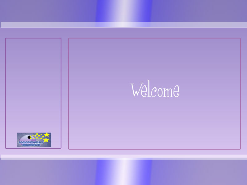
top banner is kind of smalll, color scheme is allright but a little to much purple,
layout is fairly simple and should be easy but its not completed so i can't tell,
_________________
http://i337m1k3.deviantart.com for my ART Profile. |
|
|
|
|
|
FadedinPS23
Joined: 27 Dec 2004
Posts: 183
|
| Posted: Thu Dec 30, 2004 8:02 pm Post subject: |
|
|
Thank you for the honesty. I'm working on not being so creative...It's hard.
What I mean when I say that is; I've been looking at tutorials for web design as well as website layout and I'm seeing a lot of boring, same style, designs. When I create websites I like to see a lot of creativity and eyecatching colors . I think it enhances the content on the site. Anyway, Thank You!
Sincerely
Jessica
|
|
|
|
|
|
vel
Joined: 05 Oct 2004
Posts: 339
Location: oc|ca|usa
|
| Posted: Thu Dec 30, 2004 10:01 pm Post subject: |
|
|
Just go to a major design site, and click on affiliates.
That takes you places you wouldnt believe.
_________________
postcount++; |
|
|
|
|
|
BryanDowning

Joined: 05 Jul 2004
Posts: 1554
Location: California, USA
|
| Posted: Fri Dec 31, 2004 3:21 pm Post subject: |
|
|
Color is a very tricky thing to deal with. Color on the web is ten times trickier. I wouldn't just throw in a bunch of purple to be original. Color has a lot of meaning. Too much of one color is overwhelming, no matter what color it is. You're going to have a very hard time trying to make a site that is original, because just about everthing has already been done. There's a reason why a ton of sites have a vertical navigation bar aligned to one side of the page. It works, and people are used to it. Which I agree with you is kind of boring, but hey, like I said it works well.
Keep the spirit though. It's always good to have people who won't conform. 
_________________
Best Regards,
Bryan Downing
bryandowning.com |
|
|
|
|
|
gecko

Joined: 29 Mar 2003
Posts: 293
|
| Posted: Sat Jan 01, 2005 2:17 am Post subject: |
|
|
ive been teaching in web design basics for a while
and the first thing i try to impose in the minds of my students is this;
just because something looks good by itself that doesnt mean you should use it
i mean gradients are pretty cool right?
but that doesnt mean it will make an image better
i say get rid of the gradient
and focus more on the orderliness of the template
_________________
*sketchkiddie*
http://thebluegecko.com |
|
|
|
|
|
|