|
|
| Author |
Message |
REPphantomX
Joined: 26 Dec 2004
Posts: 28
|
 Posted: Sun Jan 30, 2005 9:04 pm Post subject: shadowlinestudios template Posted: Sun Jan 30, 2005 9:04 pm Post subject: shadowlinestudios template |
 |
|
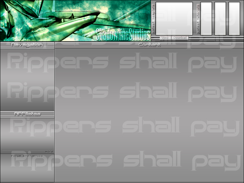
tell me wut u think
| Description: |
| shadowlinestudios tempalte |
|
| Filesize: |
197.02 KB |
| Viewed: |
663 Time(s) |
|
|
|
|
|
|
 |
witam

Joined: 27 Oct 2004
Posts: 812
Location: Belgium
|
| Posted: Mon Jan 31, 2005 12:28 am Post subject: |
|
|
I like the combination green-grey. However to have some consistency i would expect to see some green in the content-side as well (maybe the titles or something?).
It looks very clean and easy to figure out as visitor, which is a big plus. I think everything is easy readible and nicely distributed in the page.
Overall i like it!
_________________
Witam
http://members.chello.be/wotsa
http://www.shadowness.com/witam |
|
|
|
|
|
Haunus

Joined: 24 Nov 2004
Posts: 740
|
| Posted: Mon Jan 31, 2005 5:06 am Post subject: |
|
|
I think you need something in the background bu not the text, its just strange....
|
|
|
|
|
|
TiDaL

Joined: 12 Apr 2003
Posts: 384
|
| Posted: Mon Jan 31, 2005 11:26 am Post subject: |
|
|
the main text doesn't stand out enough on the banner, turnign your head makes me angry however if your a reg you will understand waht hte top bar is about
i like the design though
_________________
http://i337m1k3.deviantart.com for my ART Profile. |
|
|
|
|
|
Brad
Joined: 13 Dec 2004
Posts: 102
Location: AL
|
| Posted: Mon Jan 31, 2005 11:44 am Post subject: |
|
|
i like it alot. you may want to give some color to the text on the left that says NAV and Affiliates so they stand out a tad.
8.5/10
|
|
|
|
|
|
cyborg
Joined: 12 Oct 2004
Posts: 1102
Location: canada
|
| Posted: Tue Feb 01, 2005 8:31 am Post subject: |
|
|
i like the header alot....and the general design looks good...and like witam said you should probably add some green somewhere else.
|
|
|
|
|
|
|


