|
|
| Author |
Message |
nosse
Joined: 13 Mar 2005
Posts: 2
Location: Sweden
|
|
|
|
|
 |
witam

Joined: 27 Oct 2004
Posts: 812
Location: Belgium
|
 Posted: Mon Mar 14, 2005 7:13 am Post subject: Posted: Mon Mar 14, 2005 7:13 am Post subject: |
 |
|
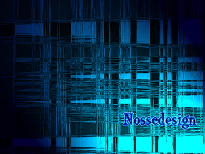
In my opinion the text doesn't fit with the background. Also this is more of a banner-design than a logo-design. Logos usually have a unique shape and color-combination. Texturing plays a part but only after you have the design of the logo-shape itself.
_________________
Witam
http://members.chello.be/wotsa
http://www.shadowness.com/witam |
|
|
|
|
|
Chaos
Joined: 06 Jan 2005
Posts: 24
Location: Sheffield,England
|
| Posted: Mon Mar 14, 2005 8:34 am Post subject: |
|
|
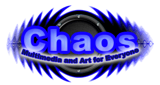
This is a logo
| Description: |
|
| Filesize: |
17.54 KB |
| Viewed: |
506 Time(s) |
|
_________________
The Chaos will come |
|
|
|
|
|
Haunus

Joined: 24 Nov 2004
Posts: 740
|
| Posted: Mon Mar 14, 2005 4:53 pm Post subject: |
|
|
logos are usually unique and a little smaller, more to the point i guess.
|
|
|
|
|
|
cyborg
Joined: 12 Oct 2004
Posts: 1102
Location: canada
|
| Posted: Mon Mar 14, 2005 6:28 pm Post subject: |
|
|
i agree...its more of a banner background....but it looks good(minus the text though)
|
|
|
|
|
|
|