|
|
| Author |
Message |
cyborg
Joined: 12 Oct 2004
Posts: 1102
Location: canada
|
 Posted: Fri Jan 14, 2005 1:37 pm Post subject: Posted: Fri Jan 14, 2005 1:37 pm Post subject: |
 |
|
ya those are sweet...and sheik i love your new one..the font looks great
|
|
|
|
|
 |
jukeboxman
Joined: 30 Dec 2004
Posts: 4
Location: Texas
|
| Posted: Fri Jan 14, 2005 4:31 pm Post subject: |
|
|
Nice work headtarget.
|
|
|
|
|
|
jdrumstik

Joined: 13 Jan 2005
Posts: 114
Location: Orange County
|
| Posted: Fri Jan 14, 2005 4:58 pm Post subject: |
|
|
Wow there is some really cool stuff in here. It inspires me to start tinkering around for my own sig, I have a personal theme "Star 5". Maybe i can do something cool with that.
|
|
|
|
|
|
BryanDowning

Joined: 05 Jul 2004
Posts: 1554
Location: California, USA
|
| Posted: Fri Jan 14, 2005 8:33 pm Post subject: |
|
|
Maybe a five-pointed star? 
_________________
Best Regards,
Bryan Downing
bryandowning.com |
|
|
|
|
|
headtarget
Joined: 13 Jan 2005
Posts: 3
|
| Posted: Sat Jan 15, 2005 4:30 pm Post subject: |
|
|
Holy carp, those look so different on a monitor that doesn't suck so bad! The resolution is a hundred times more crisp, and they're nowhere near as blended as they looked before...
Now I'm scared to see the one I did last night, I think the grid might be a bit more overbearing than I thought.
edit: okay, so why does the img break in the signature when I post, but when I preview, it shows up fine?

For clarity
|
|
|
|
|
|
BryanDowning
Joined: 05 Jul 2004
Posts: 1554
Location: California, USA
|
| Posted: Sun Jan 16, 2005 1:12 am Post subject: |
|
|
Images are not permitted in signatures. Sorry mate.
_________________
Best Regards,
Bryan Downing
bryandowning.com |
|
|
|
|
|
cyborg
Joined: 12 Oct 2004
Posts: 1102
Location: canada
|
| Posted: Mon Jan 17, 2005 1:35 pm Post subject: |
|
|
naw the grid looks great in that sig Headtarget.
|
|
|
|
|
|
Temple

Joined: 25 Nov 2004
Posts: 8
|
|
|
|
|
|
BryanDowning
Joined: 05 Jul 2004
Posts: 1554
Location: California, USA
|
| Posted: Tue Jan 18, 2005 2:54 am Post subject: |
|
|
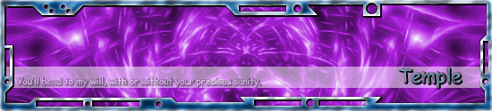
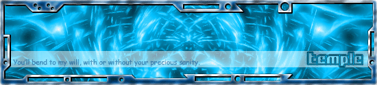
I love the design, but the purple with the blue border ruins it for me. The text is also hard to read and the font isn't as high-tech as the design, but I think it looks really really cool.
_________________
Best Regards,
Bryan Downing
bryandowning.com |
|
|
|
|
|
Temple
Joined: 25 Nov 2004
Posts: 8
|
| Posted: Tue Jan 18, 2005 12:13 pm Post subject: |
|
|
I edited the siggy. How about now?
| Description: |
|
| Filesize: |
51.22 KB |
| Viewed: |
866 Time(s) |
|
_________________
Click me! |
|
|
|
|
|
|