Joined: 19 Oct 2004
Posts: 75
Location: Lakewood, CO
Posted: Tue Oct 19, 2004 9:23 pm Post subject: * frustrated incorporated *
Ok here is the deal, for about 5 weeks now I've been trying to create a new title bar or template for a slew of themed sigs I am going to make for a site.
The sigs aren't the problem it's the damn "title bar" or that's what I call it. Basically it's where I'd name the sig or name the character in the sig if there is one.
Like in this sig, the text "The Wrath of God" and the stone bar is the Title Bar.
~~~~~~~~~~~~~~~~~~~~~~~~~~~~~~~~~~~
Thing is though is that I'd like this next one to be slightly more artsy, but not over the top...IMO. I want the Title bar to be of comprable length as the one in the above sig. Obviously the width is going to have to be bigger based upon my design idea....(which I'm getting to)
The 30 sig's I will be making will be either 300 x 100 or 300 x 125, so please take that into consideration when determining the thickness or width.
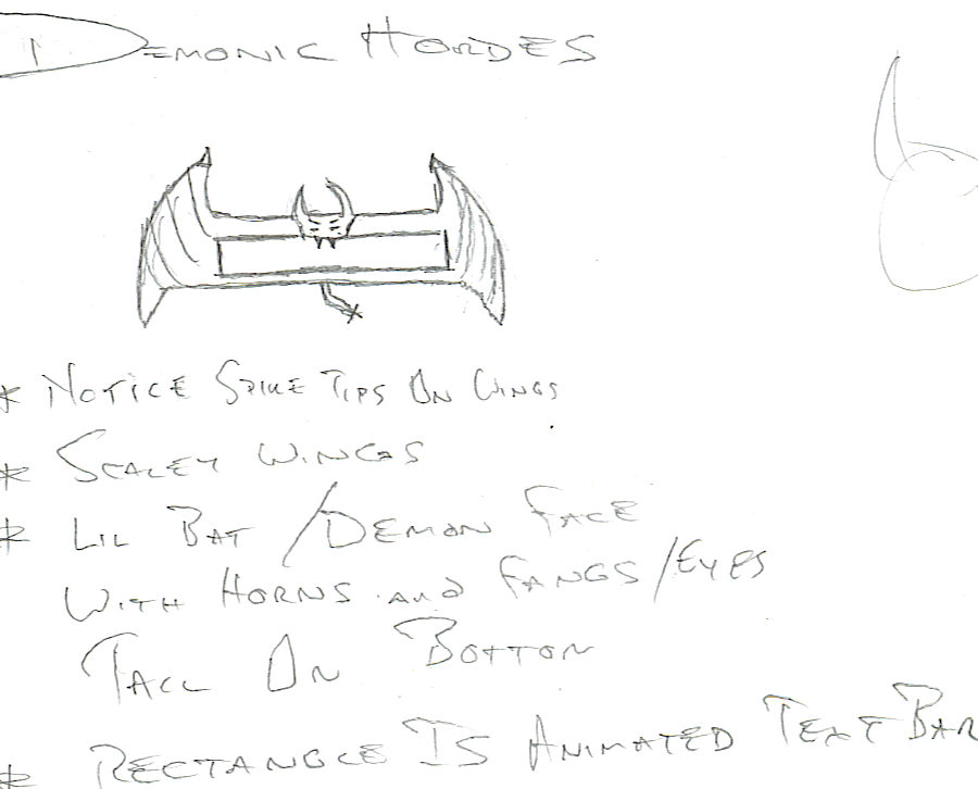
((Please View My Attached Image Below!!))
Here is what I want to have done. I want the "Title Bar" to kind of look like a Demon Figure or Gargoyle like figure, with Wings on the ends with lil horns atop the wing tips, red lines through the wings...telling me it's demonic and scaly. The lil Demon face in the middle obviously redrawn and such. I think in my crude sketch I made the wings too big or tall, so that might need to be sized down some. The rectangle in the middle is where I was going to put like animated liquid...like blood or something...but I again can't find a damned soul on this earth to create a simple but "good looking" bubble effect for the blood...a'la Diablo-esque. So I'd just take two different sketches for this, one with a rectangle area cut in the flesh/stone of the demon to which I can put the text. N' another sketch without the rectangle and I'll just center the text in there when I apply it. Lastly I'm sure you can see the little Tail below, that is of course for dramtic effect, and is not a neccessity as I skipped on the feet you notice. I guess I'm trying to create an image of "it's flying towards us".
The colors majorily used would be Black and Red mainly....darker colors...whatever looks good though. Nothing ridiculous like yellow or greens.
I do have some money, but not much, and these sigs are not being made for profit either. So I will pay if it's demanded, ON QUALITY of product though. I also don't have a CC, or paypal account, so that'd just be a real * to deal with.
I don't really think this is that tough, I just have no online image making talent, aside from the bare minimum basics. So if anyone can do this, all I need is like 2 sketch concepts for the title bar's, and I'd greatly appreciate any help provided or offered.
alright man, not gettn exactly what you want, all i'm gettn is you want this thing to be place in all your sigs? my question is, wouldnt this image be too big to put in a sig?
Joined: 19 Oct 2004
Posts: 75
Location: Lakewood, CO
Posted: Sun Oct 31, 2004 1:41 am Post subject:
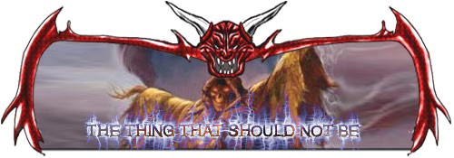
Yeah that is the case. N' I eventually found someone to do it. However you are exactly correct in your first assessment. It turned out to big as it just takes up too much of the signature's imagery. So I now have the piece and I am going to see if I can have it changed from the guy who made it, which I'll be lucky if he says yes. If someone can help it's appreciated. Basically here is what I have:
N' I also have the PSD of it. What I want to do now is, to eliminate it taking up so much of the imagery. Is take it and make it the border of the sigs. Meaning the demon head and wing extensions there would be on the top of the sig as the border. The Wings would be both the left and right side of the sig and the bottom would be the bottom. But I dunno how to resize it to make it still look good.
If anyone can resize it or basically make that design into a border for sigs of 300 x 125 size I would appreciate it. Of course the cloud filter midsection is going to have to be removed as I will be putting in different imagery in the middle of each one.
Joined: 19 Oct 2004
Posts: 75
Location: Lakewood, CO
Posted: Mon Nov 01, 2004 5:00 pm Post subject:
Thank you sir/miss for your willingness to want to help. I greatly appreciate it.
Believe it or not I got the original artist to redo it. N' here is what I got now:
N' I think it looks totally awesome.
However this puts me in the same boat as I was before. I have no title bar again for the text I'm going to put on the sigs. So after searching through tut's I found a pretty cool one and tried it out. After a lil messing around and doing some things not listed. I came up with something like this:
Problem is though is that I need to do 30 different titles on 30 different sigs. So basically I'll need to reproduce the effects each time, which ain't too bad. However my real issue is this, the Hue/Saturation of the Wind Effect. I dunno how to do this so that when I take the text and wind effects and put it onto the sig, how it will keep the correct color of the wind or hue/saturation effects.
Basically what's happening is I tried deleting the bg, merging the visible layers so that I could move it all as one piece as there are 2 or 3 layers used with the text effects included. But when I move it onto the sigs, the wind effect loses it's color. It goes all white. If I Image Adjustment > Hue Saturation then, it will change the color of the whole sig, and I don't want that. N' if I change it while all the text is merged it just changes the hue/sat of the inner text, and not the wind effect.
It's odd...it's like the wind effect becomes part of the bg after rasterizing or something. N' even with using a transparent bg, it won't let me change the hue/sat. It just stays white.
Can anyone help me reproduce this effect and be able to change the hue/sat. Because I want the whispy glow to be colored slightly to create an eerie effect. Without actually altering the color of the bg of the sig. Nor do I want to have to set this on a black bg and then cut a square out, it just won't look as good.
N' there is just no way that I'm going to cut around all the whisps for each damn title. The black you see above is the bg that they told me to make in the tut. I don't want the black, and I can't just put it on the sigs either and do the effects there. Because since the background isn't a solid color or transparent the whole sig will want to warp with the wind.
Here is the tutorial for the text effects. Mind you I added a gradient overlay, outer glow, and Bevel and Emboss on what is posted above.
That is very close to what I want, but I actually need to know how to do it, unless you wanna do that 30 different times for me. Which I doubt of course as that is asking alot.
But it's not totally exact. I see you got the Hue changed....I dunno how without a bg, but the exact Hue I want is 238 when you hit colorize, nothing else changes as far as saturation or anything.
The other thing is your text is transparent and that's not how I need it. It might look that way in the example above. But actually I need the text to initially be white as you are doing all the wind effects. Then I need the text filled in later as black to show the white wind effect emanating around it. Then I use Gradient Overlay > Foreground to Background on the text with the colors Pure Blue Violet as Fore and Black as Back, then I used an outer glow on the text, then Bevel and Emboss to kind of sharpen it up some.
However I know how to do these text changes. I just need to know how to change the hue like you did, without changing that sigs overall hue. For as I noted there are many sigs and there will be 4 total different hues used in the making of them all. This dk blue is just one of the 4.
Not really that amazing. I just used the two images you provided. I'll explain how i got that result.
I loaded your background image on layer 1. The title-image i put in a new layer (layer 2) above it. I changed the blending mode from 'normal' to 'lighten' and voilà, the result i showed. (blending modes can be found in the box in the upper left corner of your layers-window)
Hope this will help you out! If it isn't all that clear to you, don't hesitate to ask _________________ Witam
You cannot post new topics in this forum You cannot reply to topics in this forum You cannot edit your posts in this forum You cannot delete your posts in this forum You cannot vote in polls in this forum You cannot attach files in this forum You can download files in this forum